Who we are
At Neon, we’re passionate about crafting exceptional perfumes and fragrances that set the bar for innovation and quality. We started our journey as a response to the growing demand for high-quality fragrance products that deliver a one-of-a-kind experience.
At Neon, we’re more than just a fragrance company. We’re dedicated to building lasting relationships with our customers, working hand-in-hand to deliver the ultimate sensory experience. Our unparalleled attention to quality and innovation makes all the difference.
What is the secret behind the behind logo

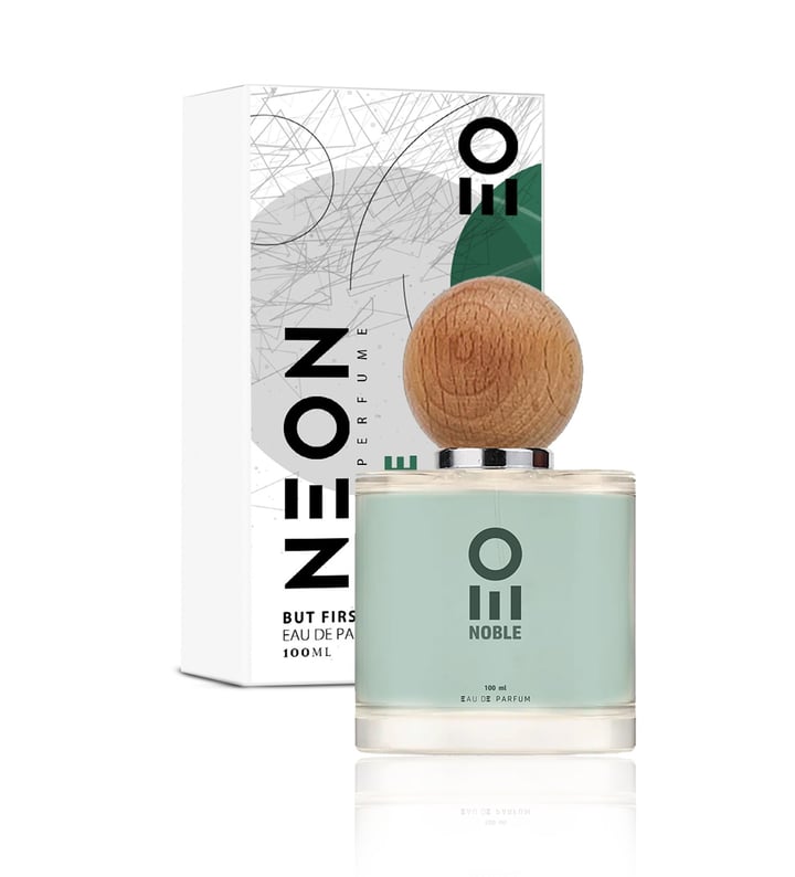
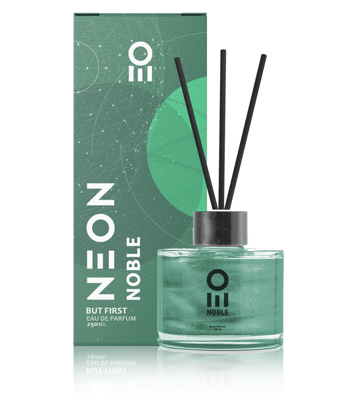
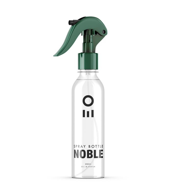
Neon logo is a simple yet striking representation of our brand. It features a circle with three columns underneath it. The circle symbolizes the universe and unity and continuity, while the columns represent strength and stability. The number of columns represent the main three scents we have.
The choice of colors in our brand is also significant. The vibrant neon pink, blue and green colors evoke a sense of energy, creativity, and innovation – all qualities that are integral to our brand identity.
Overall, the Neon logo is a visual representation of our commitment to excellence, quality, and innovation in the world of perfumes and fragrances. It represents a brand that is dedicated to creating unforgettable sensory experiences.